Kajabi Quick Tips | How to add a line or divider section to your Kajabi page for section separation

Welcome to Kajabi Quick Tips, your regular dose of Kajabi inspo.
Twice a week I share an actionable tip that's quick and easy to implement.
Use the step-by-step guide below or watch the video if you prefer to see what's happening on screen.
You'll learn more about Kajabi one quick tip at a time, so you can master the platform that runs your online business!
You'll learn more about Kajabi one quick tip at a time, so you can master the platform that runs your online business!
Just a heads up
Blog Posts from at The Unicorn Advisory may contain affiliate links, but I’m a no bullshit affiliate kinda gal, as you can read about in my affiliate disclaimer.
I only share products and services we use and love and would recommend, if there was affiliate program or not.
The few $$ we make from affiliate income, costs you absolutely nothing and goes straight to our family holiday fund ✈️ so my kids and I thank you💗
Adding a full-width line to your pages?
Designing pages in Kajabi can sometimes be a challenge - especially if you'd like to do something you think would be simple, like adding a line across the page to break up or separate sections.
Kajabi pages don't have a pre-set section for a divider (emails do) so you have to make your own.
Luckily it's pretty simple, once you know what settings to adjust and in today's quick tip I'm going to show you how!

Today's KQT
Creating a Divider Section for a Kajabi Page
Open the page you'd like to add the line or divider section to - this can be done on any Encore page (not the Kajabi legacy pages).
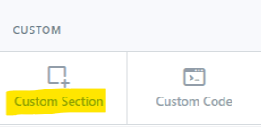
Add a section to the page - choose custom section.

Rename your section - especially if it's a large page, so you can easily place it exactly where you want on the page.
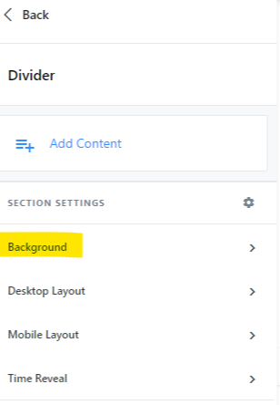
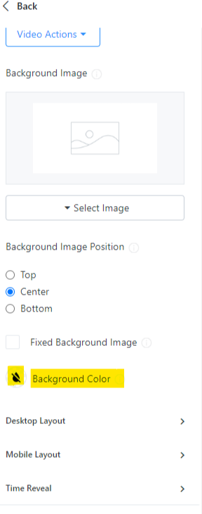
Go into the Background settings and choose your colour.


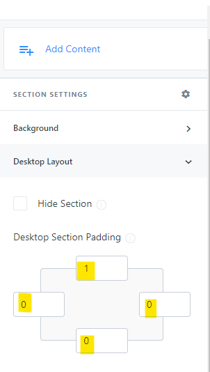
Then go into the Desktop Layout.
Change the outside padding on top to 1 and all the others to zero. Then do the same thing for Mobile Layout.
Note: if you'd like a thicker line - increase the number 1 to your preferred line thickness.

You now have a divider section for your Kajabi page that you can move around and place where you'd like.
If you would like additional divider sections, set up the first one, then duplicate to create others.
Prefer to watch on video?
View this step-by-step Kajabi Quick Tip on video, if you'd prefer a start-to-finish screen share tutorial.
Want extra Kajabi help?
If you've got Kajabi questions, please let me know what they are. Your question may become a future quick tip or tutorial 👍
Click Here to request a tip
Not yet using Kajabi?
Did you know you can get an extended 30 day free trial AND $800 in unicorn bonuses?
It's the perfect time to try out Kajabi and see if it's right for you!
Start your FREE Kajabi trial today!
One Last Thing...
You can follow a similar process to add lines in your emails - although there is a handy "divider" section in emails to make it easier.
Remember to adjust the settings to your preference - I like the thin lines you can see in this blog.
And always - check it on mobile to make sure it looks good there as well (that goes for pretty much everything in Kajabi and on websites in general though!)

Cheers, Sue x
Your Trusted Kajabi Expert 🦄
Discover the secrets to using Kajabi like a pro! 🤫
Get a Kajabi Quick Tip in your inbox twice a week
We promise to keep your email and personal info safe. Unsubscribe at any time 🤍


