Kajabi Quick Tip | How to align the CTA (call to action) button in a Kajabi Text Box
Welcome to Kajabi Quick Tips, your regular dose of Kajabi inspo.
Twice a week I share an actionable tip that's quick and easy to implement.
Use the step-by-step guide below or watch the video if you prefer to see what's happening on screen.
You'll learn more about Kajabi one quick tip at a time, so you can master the platform that runs your online business!
Just a heads up
Blog Posts from at The Unicorn Advisory may contain affiliate links, but I’m a no bullshit affiliate kinda gal, as you can read about in my affiliate disclaimer.
I only share products and services we use and love and would recommend, if there was affiliate program or not.
The few $$ we make from affiliate income, costs you absolutely nothing and goes straight to our family holiday fund ✈️ so my kids and I thank you💗
CTA Not Lining Up In A Text Box
Using the CTA (call to action) button on a text block is a quick and easy way to add a button, without having to add an extra CTA block and try to get it lined up with the text.
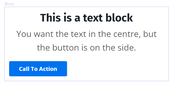
BUT what if you want centred text and your button is on the left-hand side (and looks weird 🤔)
OR if your text is left justified and the button is centred.
And you can't find any settings to change it!
It's annoying right 🤬 (or is it just me who swears at the screen? 😆)
Thankfully, it's an easy and quick fix!
Today's KQT
Choose the position of your Text Block Call to Action Button
First step is to go to the text block you want to change.
We're going to set the alignment settings for the whole block first, as that is what determines where your button will go.
We'll do desktop first...

Click into the Desktop Layout settings.
You want to choose the text alignment and pick left, centre or right (don't worry - this will change your text as well, but we'll fix that in a sec).
Choosing the text alignment ALSO chooses the button alignment.
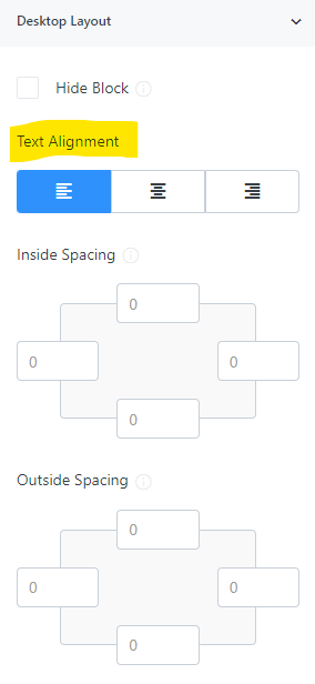
Change to where you'd like the button to be, in our case, we'd like the button in the centre.
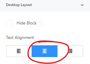
Your text and button should then both be centred.
However, if you change the position of the button and want the text to be different. For example a button in the centre, but the text left justified, just go back to the text itself.
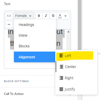
Highlight the text you want to change, in this case, we want the text left justified.
Under formats, choose alignment > left (or your preference).
Any alignment settings you change in the text box, will over-ride the desktop (or mobile) layout settings.
Speaking of mobile! Don't forget to do the same thing in the mobile settings to ensure your text and button look great on all devices 👍
Prefer to watch on video?
View this step-by-step Kajabi Quick Tip on video, if you'd prefer a start-to-finish screen share tutorial.
Want extra Kajabi help?
If you've got Kajabi questions, let me know what they are. Your question may become a future quick tip 👍
Let's Get Shit Done together!
Every six weeks, I host a Kajama Party #GSD Weekend, a relaxed and fun co-working weekend, that gives you the benefit of a Kajabi expert on hand if you get stuck or have questions.
The next one is THIS weekend (January 14 + 15)
Register now and turn you Kajabi to-do list into a to-DONE list 😍
One Last Thing...
Have you got the new image uploader in your Kajabi yet? I've had it for a few days and I am LOVING it - a very welcome change to get consistent images sizes (square or rectangle). You can also zoom in and out, flip and rotate images AND no more black backgrounds when you re-use transparent background images. YAY! 🎉

Cheers, Sue x
Your Trusted Kajabi Expert 🦄
Discover the secrets to using Kajabi like a pro! 🤫
Get a Kajabi Quick Tip in your inbox twice a week
We promise to keep your email and personal info safe. Unsubscribe at any time 🤍

